Zombie Mini Puzzles!

This is why I love Japan...well one of the reasons.  They get it.  If you remember a little while back, I did these Sesame Zombie designs.  Japan saw it and ran with it.  Here's the first product that I've seen come in. 

 Mini puzzles!  Pocket sized puzzles.  I saw three puzzles, but only these two were mini.  I would have gone with different images myself, but I'm just happy to see them giving the Zombies a chance. 

 The tiny itsy bitsy chock hazardy pieces even come in a little baggie.  I guess kids choking on tiny things isn't an issue in Japan...

 My favorite part of the packaging is the top of the box.  That is the image they should of made a puzzle of.

 Puzzle in process...no this wasn't set up for the shot...what are you talking about? 

These are the first products of the Zombies that I've seen come in from Japan.  From what I understand Sanrio, Bandai, and New Era picked up the Zombies.  Stay tuned!  More to come!

Insane chalking!

 More vandalization of the walls at Sesame Workshop.  
 This was our victim this time around. 

 Here I am roughing out the sketch and figuring out the perspective.

 After roughing things out I start adding colors and darkening lines. 

One of my partners in crime,Vanessa, joins me and starts adding details to the background. 

My other partner in vandilization, Molly, joins and lays downs some lettering. 

Molly doing her lettering thing. 

Taadaa, the finished piece.  This was the hardest chalk piece we've done so far due to figuring out the perspective of the subway exit.  But, it just had to be done. 

Here's a little time lapsy video of the process. 

Another Chalking

We got another opportunity to vandalize another wall at the Sesame Street home base.  
 This was our victim this time around.  A nice clean wall next to the exit. 
 Starting off with my part.  Character workings. 
 Molly jumps in with her part.  Letter workings. 
BAM!!  Finished piece.  A little somethin somethin for Sesame's bowling team.

 Here's a little time lapsy video.  Sorry, it's so tiny.  I haven't figured out how to put larger videos here yet. 


NYCC y'all!!

Hi y'all!  This coming Friday the 14th I'll be making my first official Comic Con appearance at NYCC.  I'll be spending some time at the Sesame Workshop booth doing some sketchy sketches of Sesame characters.  So, if you're at the Con, drop on by booth #2013, say hi, and get a sketch.  I'll only be there sketching from 2-4, so not sure how many sketches I can get in.  I'm a slow sketcher...

More exciting than that, the apparel company Mightyfine will be releasing a few shirts that I and a fellow designer (Vanessa Germosen) teamed up on.  Here are the images as we delivered them.  

I've been interested in steampunk for a while, so it was good to get the chance to put the Sesame characters through some steampunkin .  Of course, I had to put Bert in some gear.  I couldn't deck out Bert in too much gear so I added his favorite pigeon Bernice. 

The answer to steampunk Bert is steampunk Ernie with his favorite bird Rubber Duckie.  I did the character work and Vanessa laid down colors.   
Another style I've been wanting to touch for some time.  8-Bitness.  With 8-bit, I had to pay homage to the game that changed it all. 

I actually designed a full Bert.  But, this idea was too good, so 8-bit Bert had to be chopped off at the nose.  Idea by Vanessa. 

Here's a Elmo I did for Sesame for Reddit.com.  It's Elmo as the Reddit alien. 

It shot up to #1 on the front page... I'm sure the announcement of the new season didn't have to do with the post's rise...  Check it out.  It might still be there!

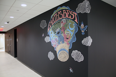
Sesame chalk mural

Here's a fun project that I was involved with for Sesame Workshop.  We (Vanessa, Molly, and I) were tasked to create a mural involving character(s) and a company logo.  This was at a 10:30 am meeting.  The mural was needed the next day...

We got down to some brain storming and I went off (like I do) to work out the final idea.  I mainly handled the design, rough layout, and characters of the piece.

 Vanessa handled everything from scenery to patterns to clouds.  Molly handled the lettering and patterns.  This is not a posed picture.  This is actually how they were working.

 This was Vanessa and I's first experience with vandalism... working on a wall.  Molly is a experienced "muralist".   We knocked the piece out in about 5 hours.  Not sure if that's fast or slow, but we did our best. 

 Since this is my blog, here's a shot of the characters.  Abby almost broke me.  She is hard to get to look cute on paper.  Never mind drawing her on a wall with chalk.  And, never doing it before.  Almost broke me...


Here's as close of a straight on shot as the width of the hallway would allow.  It works with the perspective of the piece. 

A shot to give you an idea of how it sits in the hallway.  It's pretty much invisible until you're right up on it.  Thanks to Sesame for allowing me to work on a wall for the first time ever!

 A little time lapsy video I put together of the project.  Enjoy!


Inkling practice

Can't wait to get my hands on Wacom's Inkling. So excited!


Inkling only uses pen...for now. Therefore, gotta practice sketching without the finer lines that pencil allows. Oh, by the way, this sketch was based on a guy I saw on the subway. I thought the contrast of his tank like size to his tiny hat was hilarious.

30s

Hey ya'll, I started doing these Sesame/Angry Birds mash ups, but the mashups started just looking like new birds. Didn't quite work out. But, here is what I got before I stopped.

This is supposed to be Elmo as a Angry Bird. He just looks like a new bird, right?

This is Bert. He's better than Elmo, but still looks like a all new character and not so much a mash up.

30s

I don't think these are near 30 minutes anymore, but I still call them 30s. Anyway, I've been finding it hard to find time to sketch lately. I'm sure I'll get back to it. Here's whats I got for this showing.

Saw a trailer for the Captain's movie coming up. Looked like it was a good watch, so I had to do my little version. Cookie as the Cap. I tried to change up the typical pose a bit. Not as successful as I was going for. Pose needs tweaking, but you get the idea.

This was supposed to represent my feeling for bleeding money. Figured Telly would best represent this emotion. He is supposed to be holding his neck with one hand and trying to stop the bleeding with the other. But, it seems that the money is coming out of his mouth. See kids, that's why its sometimes good to get some fresh eyes on your sketches.

Cookie is representing how I felt after the Corporate Challenge (3.5 mile run, jog, walk, crawl). I jogged maybe 2.5 miles of it. Lame. Jogging feels horrible tho. Like you're just killing yourself... very slowly.

Thanks for lookin!

Time consumed...

Here's a little taste of what's been consuming my life lately. For the past year or so, my wife and I have been in the process of selling our old place and buying a new place. Well, new in the sense that its the first time we've seen it. The place is in no way new. This quickly became the black hole that swallows up all my time. I'm not one that can visualize whole rooms in my head. I can, but I can't. You know? Anyway, so I had to put things in front of me. So, I used Illustrator to build simple mock ups of rooms. These mock ups help with measurements, color tests, placement, and so on. Not exciting at all, but very helpful.

This is the long wall of our kitchen. Keep in mind that this is a New York apt, so things have to be compact. Simple enough, right? But, just this wall alone requires decisions to be made on 12 items. These 12 items literally have hundreds if not thousands of options each.

This is the short wall of our kitchen. The little gray square is a little window. Again, these are very simple mock ups with no added unnecessary details... like window frames or backgrounds.

Because of the dip in the wall we had to think about our options of working with the dip since we couldn't spend $16,000 on custom cabinets. Yes, that IS an actual quote a contractor gave us for just the cabinets.

We're getting a wall taken out between the kitchen and the livingroom. I couldn't visualize the blocks of color and layout, so I had to mock up a 3/4 view where I could toggle on and off colors and details.

Here's a straight on view of our bathroom. Simplified to play with types of tiles and layout of fixtures. Again, a New York apt, so its a tiny bathroom. This wall has over 15 items that needed to be picked out. Amazing how a little bathroom has so many things to pick out.

This was a quick mock up to feel out the layout of fixtures and how they'd look at 3/4. Again, just blocks of shapes. No detail work.
This is a custom radiator box. I wanted to provide as much info as I could in order to cut down space for interpretation for the contractor. I didn't want to end up with a box with bad mesh on the front.

So, this is mostly the reason that I've been posting a lot less this year. This process has really sucked up all my free time. Almost there. Renovations started this week. Credit card is getting the workout of its life. Place looks like walking into a war zone... or at least what's depicted as a war zone in movies... It's all starting to happen. Bear with me. Hopefully, more interesting art will start to be created from these hands again.

30s

After some excitement over the Sesame Zombies this past week, here's some more sketchy sketches.

Had to get this one out for today's X-Men release. Besides Magneto and Professor X, Havok was one of my favs of this team. This is Ernie as Havok. As you see, I dug Havok's old suit better.

Watched myself the first part of the latest Harry Potter movies. Still entertaining to me. This is Bert as Harry.

Playin around with the Bird.

Attempted a dissection of Cookie with some true structure... wasn't as successful as I'd hoped. The forced perspective is a little extreme. Gotta try to push it.

Coooookie...

Wow, Sesame Zombies have been getting a lot of play these few days. Thanks to all that covered this style. I'm glad these little guys tickle your funny bone.

To answer one of the bloggers out there that stated that he didn't see a Cookie Monster Zombie, here he is. I looked back in my blog and couldn't believe that I hadn't post him up earlier. He was actually one of the earliest characters created in this line. As this blogger mentioned, he pretty much has the same mentality... but towards cookies. So, here he is, Cookie Zombie!

Zombie Originals

Here are the original designs of the Sesame Zombie used on the Mightyfine shirts. I did the characters and Mightyfine's artist added and altered details that you see on the shirts.

Oscar. I was going to add Slimey, but ran out of time. Maybe, in the future.

Big Bird. His shape actually needed some work from the sketch to make it more... kid friendly.

Elmo. Simple. Still one of my favorites.

Ernie. He has my favorite hair of all the Zombies. The idea was inspired by a dog that I remember seeing from my trip to Hong Kong when I was 9. It was an alley dog. At 9 it was the first time I had seen an street dog in real life, so it stuck in my head. Taadaa, Ernie's hair!

Bert. His uni-brow came in real handy with this design line.

Count. Last one done. My favorite. He just had so many details to play with.

There are a few more that haven't been used yet. If you scroll back in this blog, you'll see some in pencil form. Maybe, a couple in near finished form. I'll post them later. I wanted to focus on the ones used for the Mightyfine shirts in this post. Hope you enjoyed the tour!