NYCC - Steampunk Oscar

Hey folks!  Here's a piece I did for Sesame for Mightyfine for NYCC.  Continuing with last years steampunk theme, I went with Oscar.  It's actually one that I wanted to do last year, but just didn't have the time for.  I conceptualized, penciled, and inked this piece. 
This is the "inked" version of the piece.  I used "" because only the outline was ever inked.  The interior lines are all tight pencils.

As you can see this is the color version of the piece.  The colors were done by the talented designer Vanessa.  She put in a little extra grit for Oscar. 

And this is the finished product.  This was given to us by the fine folks at Mightyfine.  So if you want this shirt or just want to see it in person AND you're at NYCC, take a stroll over to the Mightyfine booth.  It's one of the displayed shirts. 

Sesame Bits - Preschool is Cool

These are the pencils for the most recent Sesame Bits comic.

The idea was built on the bit on the DVD that Rosita loves to play hide and seek.  Then, thinking of what would be the best way to hide.  What better than poofing into thin air?  Yeh, that gag.  Enjoy!    

NYCC sneak peek

Here's a little something I'm working on for NYCC.


Hint: it's a continuation of a set I worked on for last year. Stay tuned to see the progress.

Sesame Bits - Elmo's Alphabet Challenge

Here's the pencils to the latest Sesame Bits comic strip.  This was done for the release of the Elmo's Alphabet Challenge DVD.  

I really enjoyed work on this one because of the gaming aspect of it.  As soon as the idea came to me I knew that Ernie had to be playing the original GameBoy.  If I could add sound to the comic strip, I would have had the Tetris music playing or Super Mario Land or Double Dragon.  The strip was great fun to draw because of the different versions of Bert that I was able to explore.  But, I got to say, drawing Ernie playing the GameBoy was the highlight.  I know that pose well.  See, all that time spent playing GameBoy did come in useful!  Game on! 

Sesame Bits sneak peek

Here's a sneak peek at the next Sesame Bits. Gaming!


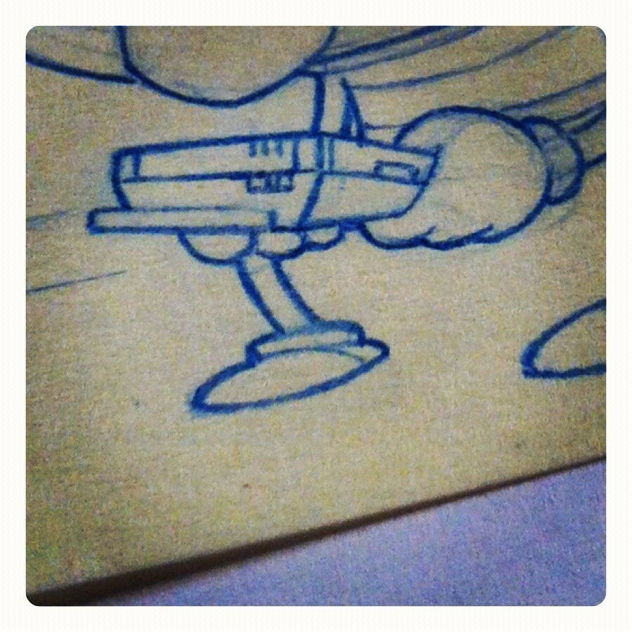
You might recognize the hand held system. I went old school and borrowed from my past.

Sesame Bits - Elmo's Magic Numbers

Here are the pencils for the new Sesame Bits just posted yesterday on the Sesame Facebook page.  

For this strip I designed a new character style to be used only with the Sesame Bits strips in order to give the strips their own look.  So new that I'm still tweaking the designs.  Deadlines are deadlines, so I had to use the designs before they were totally tweaked to my liking.  Well, Cookie and Bert were done.  Still working on other characters.  I'll post character lineup later.  The strip seems to be getting some good feedback.  Go check it out if you haven't yet.  Enjoy!

Zombies on NewEra/Sanrio caps

When I found out this was happening I was quite excited see my work on New Era caps.  Then, to find out that Sanrio pushed the zombies, I was beside myself.  New Era teamed up with Sanrio teaming up with Sesame to bring you these zombie caps.  Unfortunately, I think these are exclusive to Japan.  You may be able to hunt them down if you check on New Era's Japan site.  I think Cookie and Oscar may be sold out already. 

 Cookie

Bert

 Elmo

 Ernie
Oscar

Character names raised on the back of the caps. 
 
With matching New Era logos on the sides of the caps.


Chalking - Grover MJ

I was asked to work on a chalk piece for Sesame's health and wellness Broadway dance program.  I'm not much of a dancer...at all.  But, when I think of dance, one individual comes to mind immediately.  MJ.  He had many iconic poses, but this one was always one of my favorite.  So, I decided to put Grover into this iconic pose. 

This is the planning stage.  Sketchy sketch.  I always have to work out a sketch before I actually put chalk to surface.  Got to get my head around it before actually attempting it. 

 Here's me "rubbing" the chalk into the wall as my "sketch" stage.

 After rubbing in the rough, I went in with white chalk to clean up the lines. 

Added some dashes of color to finish off the piece.  Fellow artists, Molly Hein, did the lettering and texts. 


Here's a time lapse vid of the process.  Short and shweeet. 

Sesame Bit - Singing with the Stars - Strip #1

It's that time again.  These are the pencils to the most recent Sesame Bits strip. 

I changed up the layout a little on this one.  Playing around and seeing what works.  I did pencils and colors were done by Mark and Diana(staff artists at Sesame Workshop).  

Sesame Bits - Big Elmo Fun strip #2

These are the pencils for strip #2 for the Big Elmo Fun DVD promotion.  This time Telly and Elmo are checking out bugs in front of 123 Sesame. 
More copy than I would usually want, but it was necessary.  The bugs and magnifying glass were the fun parts to figure out on this one.  Enjoy!

Art of - Sesame Zombies

Here's a little look behind he scenes of creating the Sesame Zombies.


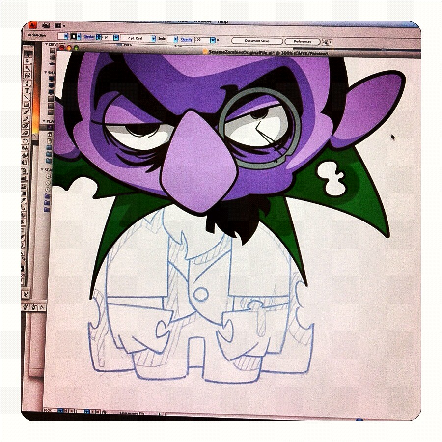
This is where I'm building the digital version over the scanned blueline sketch version of zombie Count. If the project allows for it, I like working out my characters in pencil first.

Sesame Bit - Big Elmo Fun strip 1

Here's the latest Sesame Bits comic strip that I penciled.  This one was based off one of the segments on the Big Elmo Fun DVD.  

BAAWK BAAAAWK!!  Love those chickens!  Enjoy!

Sesame Bits - BG

Hey there folks, here's a little "behind the scenes" view of the most recent Sesame Bits.  This is a look at the background.  11x17, copy paper, and blue pencil.  Nothing fancy.  

This is the full background before characters, props, details, speech balloons, and dotted path were added.

Here's a closer look at Mr. Hooper's store.  On the finished strip there is a tree added in front of the store.
 
This is the 123 Sesame brownstone.  Also had a tree in front of it in the finished strip. 


Sesame Bits - Pencils

Here it is folks.  These are my pencils for this edition of Sesame Bits.  This time around I was inspired by the dotted path stylings of Bil Keane's Family Circus comics.  Loved these when I was young, so it was fun to create my own interpretation of the idea for Sesame.  

This was a beast to pencil.  Now I have an idea why we didn't see more of these.  The addition of the detailed background is a lot more work than adding hints of a background to a regular panel comic layout.  Which I did in the past few Sesame Bits.  I used Illustrator to create the balloons and the dotted path.  Everything else was pencil to paper.  This one worked my drawing hand out thoroughly.  Sore for days, but well worth it!  

Hope y'alls enjoy!

Strip numero 2

Here are the pencils as I submitted them for the most recent Sesame Street DVD comic strip. 

The final layout, color, and finishing touches that you see in the final product was done by Diana Leto and Mark Magner. 

Zombie plush!

 Woohoo!  Zombie plush!  I never really know where the zombie designs go, so its always a nice surprise to see product show up.
I first saw these guys as prototypes.  They needed a lot of help.  They didn't know how to position the body, arms, and legs to give them the lunging forward posture.  I did some detailed bluelining and sent them back.  I didn't see them again till they were released.  I was worried, but I was pleasantly surprised.  The characters sit well, have a nice weight distribution to support their large heads, and they have a great forward lean to them.  These have become my favorite products made from my designs. 

They also made Zombie keychains.  Not as good as the plush, but not bad.  Both the plush and keychains are exclusive to Japan.  
  

Strip!

My first comic strip!  Here's a little strip I did for Sesame Workshop.  Sesame used it with the release of their Iron Monster and Sesame Heroes DVD as an online component. 

This was a rush project which left no time to properly experiment or play with ideas.  Just had to push forward and keep it simple. 

This is the finished version with colors added by fellow artist Vanessa Germosen.